When we talk about website design, we see strong competition now. Three decades ago, these things were algorithms that fit geeks, who don’t appear in public and can do miraculous things like destroy the world. Now it’s not difficult to look at the people next to you on the coffee shop and find them working on designing a website. Website or fix bugs after design.
We can describe the current landscape with regard to website design as very changing, in a rapid race to find the best solutions for web design for developers, provided that these solutions are integrated, flexible, scalable and easy to deal with, contrary to what everyone thought in the past that this information is surrounded by steel walls, As if they were military secrets, the current trend is towards spreading this information.
Top 10 Website Design Templates for 2022
These are the latest web design methods and techniques, with a simplified and brief explanation for non-specialists
1- Flat and 3D illustrations
Designing a website using illustrations is one of the fun ways for both the developer and the user. It turns a plain boring website into a stunning display of graphics and technical elements, an effective way to convey your branding messages. Slack’s latest update is one of the best templates on this site. The wonderful method, which is based on the visual narration method for the users of the site.
This method adopts multiple sites and platforms, uses 3D or flat graphics, and displays hilarious characters to ease the seriousness that employees and teams can face when using these sites.
2- Designs for everyone
This method depends on the ability to connect websites to all users, who suffer from visual or neurological disabilities, and gives them access, and uses several layers merged with each other so that they are not visible to the rest of the users, for example Trello site to organize tasks between work teams or corporate employees as an example of ways Designing a website in this way, it allows color-blind people to use and access the site without a problem, by incorporating appropriate technologies for them without disturbing the rest of the users.
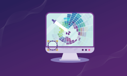
3- Bring color to life
A website can be designed in a wonderful way that uses colors as a means to attract users and make their journey in the site enjoyable, this method comes by merging several layers of colors with each other in an elegant and luxurious way, and gives warmth to users, through an appearance that reshapes the physical elements of the user and dyes them with new colors to create a new world fully.
Waaark, affiliated with the French creative studio of the same name, is the greatest example of this point, as its interface attracts you as soon as you open the site, and its warm colors take you on a very wonderful journey, whenever you browse the site or enter its sections.
4- Split screen
The split screen comes as one of the most important ways to display content in the best possible way, attracting users and providing them with vibrant colors, texts with clear and strong fonts, and the need for smoothness in displaying content and the ability to scroll, interactive elements and smooth transition to any page, and for the aesthetics of the page It should contain harmonious images even if they are separate, so as not to disturb the eye, with excellent use of white space, and its greatest benefit lies in displaying separate messages for the brand.
E-commerce platforms and online stores come as the biggest example of this method, especially in their interfaces, which should entice the user to browse the shelves and encourage him to order.
5- Geometric division
This method is used most often by engineering consultancy offices and architectural planning companies, and is used as a marketing for itself and to convey an inspiration to great organization, accuracy and perfection in the implementation of projects.
This method relies on the use of geometric shapes such as squares, triangles, circles, and hexagons, and works to make them as boxes for content. Contrary to the flow that we mentioned earlier, the movements in these sites are geometrically as if you were running an engineering machine, as it expresses the style of work in the organization in general, It is a way to dazzle customers to the fullest.
6- Text in bold
Another way to convey corporate messages and give the necessary inspiration to the image that the organization wants to paint for itself, this method is used on the outlines in the texts, the exciting atmosphere with which the customer feels that he is surrounded by these messages and must be convinced of them now, a method that is not preferred by many, whether from customers or from Website designers, but with professionals and confident people will come with great results, to find the site is full of successive texts, which express the credibility of the company and entrench its values in the mind of the customer.
7- One-page sites
You don’t need a lot of categorizing the site into sections containing pages, this format tends to be the most effective is the simplest, as it depends on scrolling between pages, it is suitable for sites that use mini themes, and does not need a lot of content to express itself, similar to a newsletter Or focus on products and services, it can be ventured by small companies that want excitement or giant brands that do not need a lot of advertising to convince, it is a matter of bragging as well, and it is convenient for the user because it does not distract him or make him open a lot of pages to get content .
8- Responsible Motion Graphics
With a lot of website design methods that have become mainstream trends, Motion Graphics comes as a way to attract attention, especially with the high speeds of the Internet and devices that have high-quality processors, which can display animations in the best way and as they were actually designed, as the capabilities of devices in the past did not accommodate free creativity. For web designers.
We added responsibility here because the great potential of the hardware might tempt avid designers to give the user headaches with graphics and motion noise, so the design should be very relevant to the theme of the site, as well as to what the user can tolerate.
9- Glass designs
This method comes to convey the feeling of transparency to the user by using a shape that looks glass and makes you move the page elements as if they are behind frosted glass, these methods create an optical illusion and use manipulation to make the use experience wonderful and enjoyable, and it is designed very carefully so as not to cause visual clutter, and at the same time It gives the feeling that the elements are three dimensional, and many logos and illustrations are used in all sections to express the themes presented by the site.
10- Floating Elements
It’s not about Archimedes and his theory, it’s about the elements on the page making you feel like they’re floating, you can move them as if you were moving a dry leaf in a lake, this method is fun for users and gives a feeling of satisfaction, using 3D illustrations in a smart, and in a way that is not wasteful In order not to kill the idea.
For more about corporate website design, contact Ocoda Design Company, which has a selection of the best designers. Do not hesitate to contact us now and meet creativity and innovation.